Books for Kids Who Hate Reading: What Actually Helps
By Yechiel Kuperman, marine biologist · 49 years keeping fish
Quick answer
A child who hates reading is usually not lazy and usually not behind. Reading is simply costing them more effort than it costs everyone else.
Pick a book they can finish rather than one that matches their age, let them choose it, and look at the page layout before you look at the reading level.
The single best-evidenced change is wider letter and word spacing — not a special dyslexia typeface, which the research does not support.
The numbers
| Change | What the research shows | How strong the evidence is |
|---|---|---|
| Wider letter and word spacing | About 7% more words per minute | Strong — and this is the effect usually credited to the font instead |
| A special “dyslexia font” | No measurable improvement | Strong evidence of no benefit; most children tested preferred plain Arial |
| Plain sans-serif over serif or italic | Faster reading, shorter eye fixations | Moderate — one eye-tracking study of readers aged 11 to 50 |
| Atkinson Hyperlegible specifically | No published reading study exists | Untested. A sensible free choice, but not an evidence-based one |
| Generous line spacing, about 1.5x | Part of the same spacing effect | Strong, by the same research that credits spacing over letterforms |
| Short chapters they can finish | No controlled study we could find | Thin evidence. We recommend it anyway, and we say so honestly |
Do this — step by step
- Take the pressure off completely for two weeks.Nothing improves while reading is a nightly argument
- Let them choose the book themselves, and do not veto the choice.
- Look at the page before you look at the reading level.Spacing, line length, white space, chapter length
- Pick a book they can finish rather than one that stretches them.Finishing is the thing that changes how they see themselves
- Read the first chapter aloud yourself, then stop and leave it with them.
- Set ten minutes, and stop at ten minutes even when it is going well.Ending while it still feels good is the whole trick
- Never ask them to read aloud to prove they read it.
- Let them re-read the same book as many times as they like.Re-reading builds fluency; it is not cheating
What actually makes a book easier to read?
Mostly the page, not the words on it.
The popular answer is a special typeface. Several exist, they are sold as a solution for dyslexia, and they are recommended in a great many articles. The evidence for them is genuinely poor, and it is worth knowing why.
The most useful study here tested one of those fonts against ordinary Arial. Low-progress readers did read about 7% more words per minute in the special font — a real result, and the one everybody quotes.
Then the researchers matched Arial's letter and word spacing to the special font's, and ran it again. The difference vanished.
So the gain was never in the letter shapes. It was in the space between them. That is a much cheaper thing to fix, and you can do it with almost any typeface.
Two further studies looked for a benefit from the letterforms directly, one across 170 children with dyslexia and one using eye-tracking. Neither found one. In both, most children preferred the ordinary font.
What eye-tracking did find was duller and more useful: plain sans-serif type beats serif and italic, and monospaced beats proportional. Nothing exotic. Just clean, evenly spaced letters.
None of this means a child is imagining the difficulty. It means the difficulty is in decoding, and layout can lighten the load a little while decoding gets better with practice.
The other half is finishing. A child who has never finished a book has no evidence that they can, and that belief does more damage than any typeface fixes.
This is why a short book slightly below their level often beats the right book for their age. They finish it. Then they want another one.
That is the whole strategy, and it is unglamorous. Reduce the cost per page. Increase the chance of reaching the end. Then get out of the way.
By the way, out in the ocean…
Shark. Great whites get the headlines, but the biggest shark of all — the whale shark — is a gentle giant that eats plankton. Shark books win over more reluctant readers than almost any other subject — curiosity beats reading levels.
Killer whale (orca). A powerful apex hunter that is actually the largest dolphin — living in close family pods, each with its own dialect. A child who 'hates books' will often devour one about orca families — the right topic does the heavy lifting.
From 49 Years at the Farm
Yechiel, on why his own books are set the way they are
I am dyslexic. I do not write these books — I tell them, and somebody else types.
That is not modesty and it is not a complaint. It is a working arrangement, and it exists because reading and writing have always cost me more than they cost other people.
So when it came to printing the books, I was not choosing a typeface as a designer. I was choosing it as a reader.
They are set in Atkinson Hyperlegible, at one and a half line spacing.
I chose the spacing first, and the typeface second. That order matters. The research agrees with it, though I picked it from print production rather than from a paper.
Letters that sit too close together are the thing that makes a page look like a wall. Open the lines up and the same words stop looking like work.
I will not tell you the typeface is proven, because it is not. Nobody has published a study on it. It is a careful, well-argued choice, and it is free, and that is all I would claim for it.
The spacing, though. The spacing I would defend.
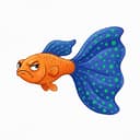
George the Cranky Guppy’s Logbook Card
Guppy · reluctant subject of ten books
I did not ask to be in a book. Nobody consulted me. One day a man with a notepad was standing at the glass and the next thing I know there are ten of them.
But I have seen the pages, and I will say this much. They are not crowded. There is room around the words, which I appreciate, being a fish who likes room.
If you are a child who finds reading hard, start with mine. Not because they are the best. Because they are short, and you will finish one.
Then you can tell everybody you finished a book. That is worth more than it sounds.
What goes wrong when parents try to help
Buying the book that matches their age
A book at the right age but the wrong difficulty gets abandoned, and an abandoned book is more evidence for the story they already believe about themselves.
Go below the level. A finished easy book beats an unfinished right one every time.
Turning reading into a nightly obligation with a timer
Twenty minutes enforced every evening reliably produces a child who reads for exactly twenty minutes and never picks a book up otherwise.
Ten minutes, stopped early while it is still going well, does more.
Buying the special font and stopping there
This is the one this page exists for. The font is the visible, purchasable, satisfying-feeling action, and it is the part the evidence does not support.
If the book you buy happens to be generously spaced, you already have the benefit. Check the spacing, not the label on the cover.
Asking them to read aloud to check they understood
Reading aloud is a performance, and it is much harder than reading silently. Asking for it turns a private success into a public test.
If you want to know whether they enjoyed it, ask what happened in it.
Treating re-reading as a waste of time
A child re-reading the same book is not stuck. They are reading something they can already decode, which is exactly how fluency is built.
Let it run its course. They will move on when they are ready.
Questions we get asked
What are good books for kids who hate reading?
Short chapters, generous spacing, plenty of white space, and a story that starts quickly.
Illustrated chapter books and anything humorous tend to work, because both give a reason to turn the page that is not duty. Let the child pick from a shortlist rather than handing them one.
My 8 year old hates reading — what do I do?
Stop the nightly reading battle for two weeks. It is doing more harm than the missed practice.
Then restart with a book below their level, ten minutes at a time, and no reading aloud. You are rebuilding the idea that a book can be finished.
Are dyslexia fonts worth it?
Probably not for the reason they are sold. Controlled studies found no reading gain from the letter shapes themselves, and most children tested preferred an ordinary font.
What does help is the wider spacing those fonts ship with — and you can get that from almost any clean sans-serif.
Should I let my child read books that are too easy?
Yes. An easy book that gets finished builds fluency and, more importantly, builds the belief that finishing is possible.
Difficulty can come later, and it will come faster from a child who thinks of themselves as someone who reads.
How long should a reluctant reader read for?
Ten minutes is plenty at the start, and stopping at ten minutes matters as much as starting.
Ending while it is still enjoyable is what makes tomorrow easier. Reading until they are tired teaches them that reading ends in being tired.
Do audiobooks count as reading?
They are not decoding practice, so they will not build that skill on their own.
But they build vocabulary, story sense and appetite, and a child who loves stories has a reason to keep working at the harder version. Running the audio alongside the printed book suits many children.
How do I know if it is dyslexia?
You do not, from a website, and neither do we. Persistent difficulty with decoding despite good teaching is the usual flag, especially where spoken language is strong.
Ask the school for an assessment. Nothing on this page substitutes for one.
How do I get a 9 year old interested in reading?
Start from an interest they already have — animals, jokes, gaming, space — and find the funniest, easiest book inside it. At nine, choosing the book themselves does more than any amount of encouragement about it.
Then make reading cheap: ten minutes counts, easy books count, comics and audiobooks count, and nobody gets quizzed afterwards. A nine year old who finishes things reads more — momentum matters more than level.
Sources
- Marinus et al. 2016Marinus, E., Mostard, M., Segers, E., Schubert, T. M., Madelaine, A. & Wheldall, K. (2016). A Special Font for People with Dyslexia: Does it Work and, if so, why? Dyslexia 22(3), 233–244. View sourceNote: This is the study most often cited in support of dyslexia fonts, and read in full it argues the opposite: the advantage disappeared once ordinary Arial was matched for spacing.
- Kuster et al. 2018Kuster, S. M., van Weerdenburg, M., Gompel, M. & Bosman, A. M. T. (2018). Dyslexie font does not benefit reading in children with or without dyslexia. Annals of Dyslexia 68, 25–42. View source
- Wery & Diliberto 2017Wery, J. J. & Diliberto, J. A. (2017). The effect of a specialized dyslexia font, OpenDyslexic, on reading rate and accuracy. Annals of Dyslexia 67(2), 114–127. View source
- Rello & Baeza-Yates 2013Rello, L. & Baeza-Yates, R. (2013). Good fonts for dyslexia. Proceedings of the 15th International ACM SIGACCESS Conference on Computers and Accessibility (ASSETS '13). View source
- Braille InstituteBraille Institute of America. Atkinson Hyperlegible Font. Designed with Applied Design Works, released 2019. View sourceNote: The typeface's design rationale is well argued, but as of mid-2026 we could find no published, peer-reviewed study measuring a reading gain from it.
About the author
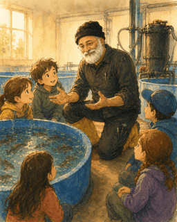
Yechiel Kuperman
Marine Biologist
Yechiel has kept fish since he was four — 49 years with tanks — and 30+ years running farms.
He writes the Yechiel's Fishery Farm books, in which the biology is real and the fish have opinions.
Last checked: