Some Children Read Differently.
These Books Were Made for Them.
Designed for readers who need more space.
Real science. Genuinely funny stories. Built from the first page for children with dyslexia, ADHD, and processing differences — and for any child who needs the right book.
Not because they are not smart.
One in five children finds reading harder than it should be.
Not because they are not smart. Not because they do not love stories. But because most books were not designed with their eyes in mind.
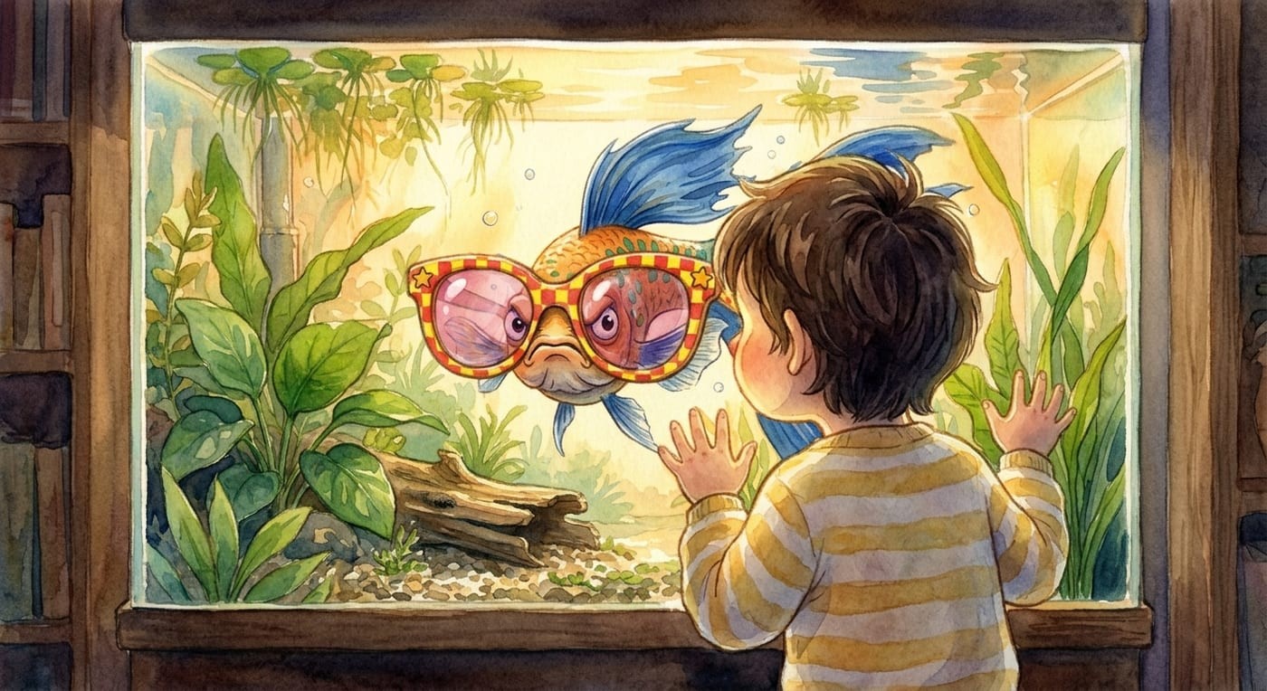
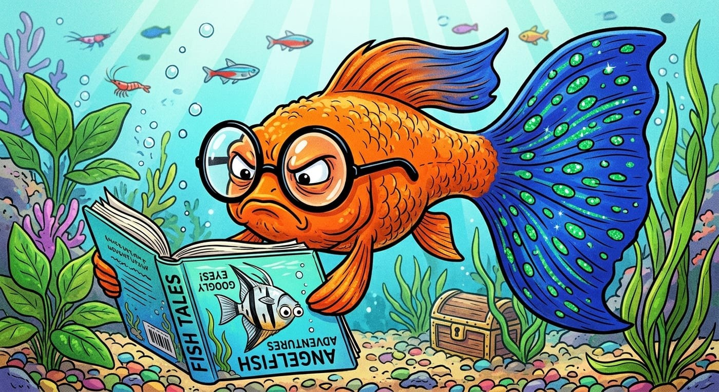
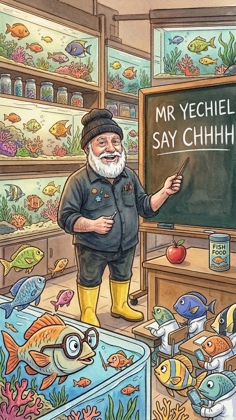
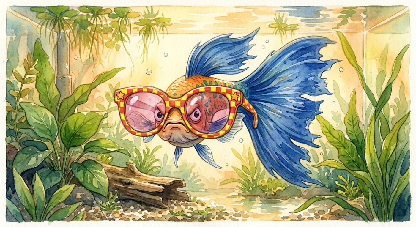
Yechiel's Fishery Farm was.
Every book in this series is built from the ground up for readers who need a little more breathing room on the page — and a lot more story to keep them turning it.
What “dyslexia-friendly” means in these books
Large, clear type
Set in a font designed specifically for readers with visual processing difficulties. Letters that do not mirror each other. Words that sit still on the page.
Room to breathe
Generous space between every line. Short paragraphs. One idea at a time. Each page has somewhere for the eye to rest.
Chapters that finish
Every chapter is short enough to complete in a single sitting — fifteen to twenty minutes. Children who struggle with reading need to feel the win of finishing something. These books give them that, every single chapter.
No walls of text. Ever.
Dialogue always gets its own line. Scenes separate cleanly. The page never crowds the reader.
Real science. Real stories. No small print.
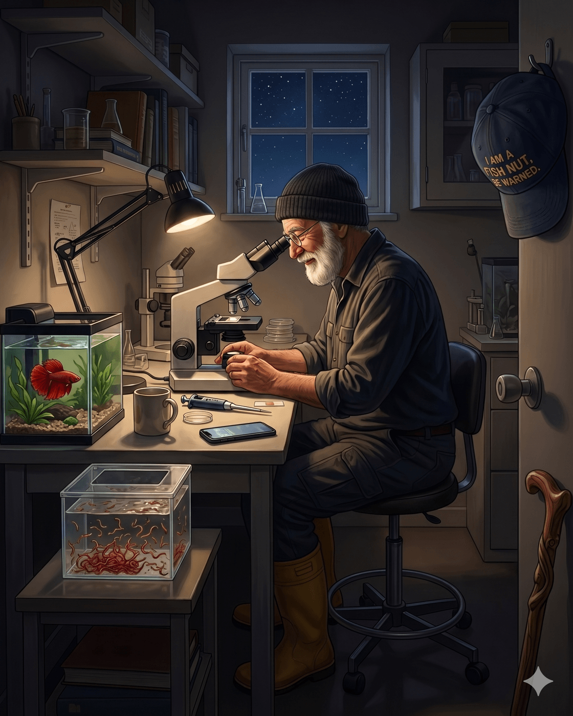
These are not simplified science books dressed up as fiction. They are proper stories — funny, warm, full of characters your child will argue about at dinner — that happen to be written by Yechiel, who has kept fish for forty-nine years.
Every biological fact in every book is true. Checked by the author, who has spent his career doing exactly what Yechiel does in the stories: watching, recording, wondering, and occasionally being outwitted by a fish.
Children who find reading hard are often the ones who most need the right book. A book that respects their intelligence. That gives them real science, not babytalk. That makes them feel like the clever reader they actually are.
The books that finally worked.
“He finished a chapter. First time this year.”
“She asked me what a plecostomus eats for breakfast. I had no idea. She explained it to me.”
“Finally — a book I can read aloud without losing my place, and he can follow along without losing his.”
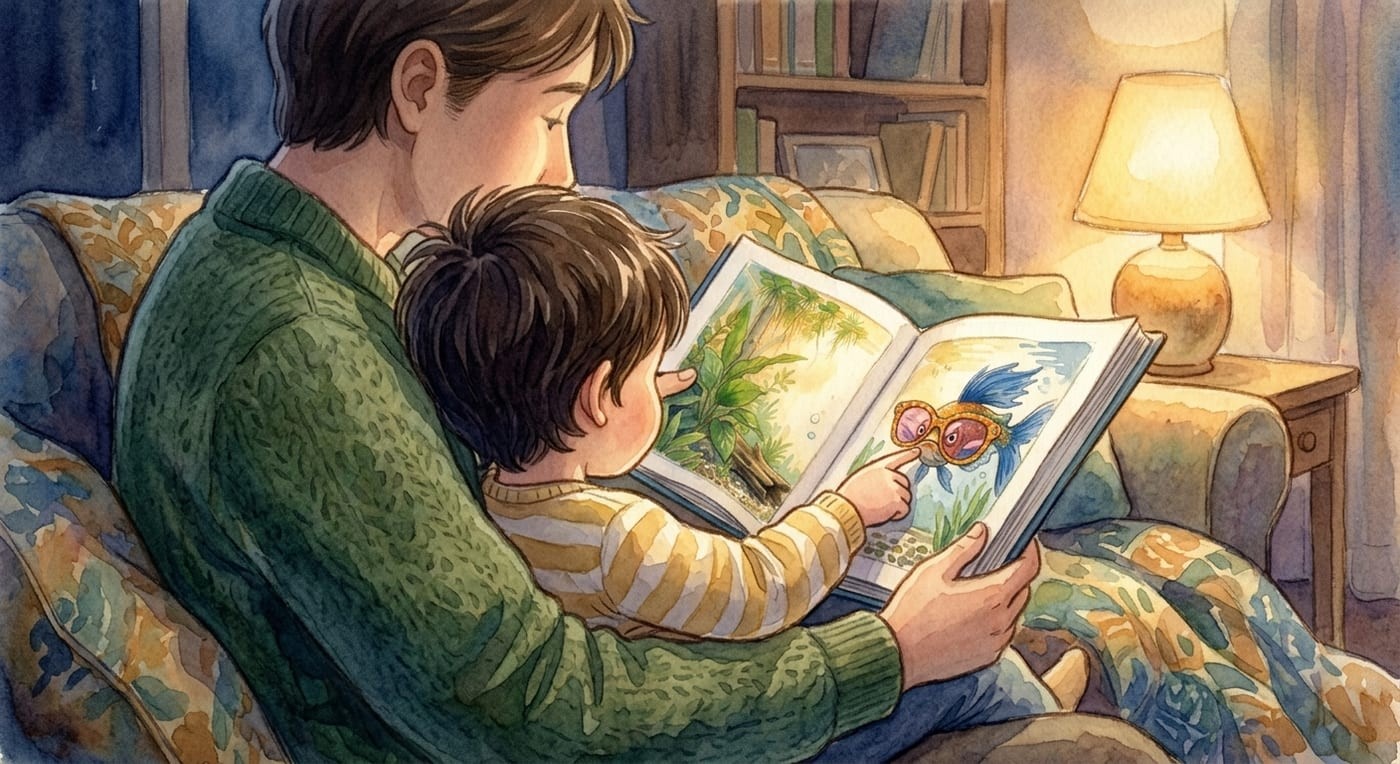
These books work in the classroom, at bedtime, and on long car journeys. They work for children with dyslexia, with ADHD, with processing differences, and with no diagnosis at all — just a short attention span and a strong opinion about fish.
Every decision made for the reader.
These are not cosmetic choices. Every typographic and layout decision in this series was made with one question: does this help the reader stay on the page?
| Detail | What we chose and why |
|---|---|
| Font | Atkinson Hyperlegible — designed by the Braille Institute for low-vision readers; we chose it because its letterforms are hard to confuse. |
| Line spacing | 1.5× standard — wider than a typical children's book. |
| Font size | 14pt body text — larger than industry standard for this age group. |
| Paragraph length | 1–3 lines maximum. |
| Dialogue | Always on its own line. Never buried inside a paragraph. |
| Chapter length | 1,000–1,400 words. Fifteen to twenty minutes per chapter. |
| Page size | 6" × 9" — generous page, generous margins, generous everything. |
Questions parents ask us
What makes a children's book dyslexia-friendly?
A dyslexia-friendly book changes the presentation, not the content: a typeface with unambiguous letterforms, larger text with extra line spacing, short paragraphs, dialogue on its own lines, off-white paper, and chapters sized so a child can finish one in a single sitting. The story and the science stay at full strength.
Which font do the books use, and why?
We use Atkinson Hyperlegible, developed by the Braille Institute. Its letterforms are deliberately distinct — b, d, p, and q cannot be mirror-confused, and 1, l, and I are clearly different characters — which removes a whole category of decoding errors before a child reads the first sentence. We set it at 14pt with 1.5× line spacing.
How long should chapters be for a reluctant reader?
Short enough to finish, long enough to matter. Our chapters run 1,000–1,400 words — roughly ten minutes read aloud or one independent sitting for an 8–10-year-old. A reluctant reader who completes a real chapter gets a genuine win, and each chapter ends on a hook that makes starting the next one the child's own idea.
Why cream paper instead of bright white?
Bright white paper reflects the most light, and for many readers with dyslexia or visual stress that glare makes letters shimmer and swim. A soft cream page lowers the harsh contrast while keeping the text perfectly crisp — more comfortable for sensitive eyes, and a calmer reading experience for everyone else.
Your child deserves a book that was made for them.
Not adapted. Not simplified. Not a “special edition.”
Made for them, from the first page.